
Website layout, text and images all scale to fit the device's available viewport. This is achieved with CSS Viewport Units. No other frameworks, advanced JavaScripts or polyfills were used here. Placeholder images courtesy of Lorempixel.com
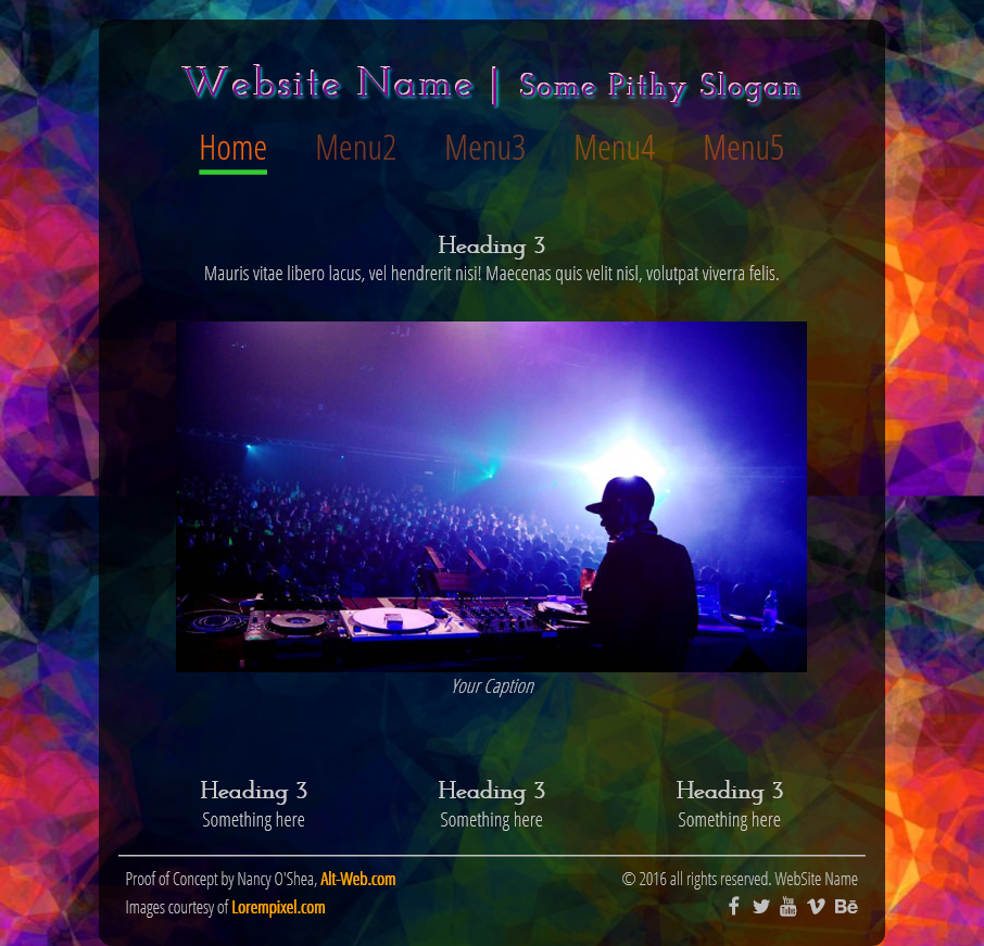
Desktop Layout
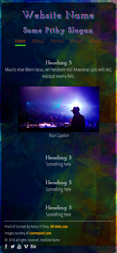
Mobile Layout
CSS CODE:
/**CSS Reset**/
* {
-moz-box-sizing: border-box;
-webkit-box-sizing: border-box;
box-sizing: border-box;
}
/**Layout, styles and typography**/
body {
margin: 0;
color: #CCC;
font-size: 2vw;
font-family: 'Open Sans Condensed', sans-serif;
background: #0D42A0 url(http://lorempixel.com/900/500/abstract/7) center center fixed;
/**for Safari,Chrome**/
-webkit-background-size: cover;
/**for Firefox**/
-moz-background-size: cover;
/**for Opera**/
-o-background-size: cover;
/**for other browsers**/
background-size: cover;
}
h1, h2, h3 {
font-family: 'Josefin Slab', serif;
margin-bottom: 0;
}
p { margin-bottom: 0; }
.container {
margin-top: 2%;
padding: 2%;
background: rgba(0,0,0,0.7);
border-radius: 12px;
width: 80%;
margin-left: auto;
margin-right: auto;
text-align: center;
}
header * {
display: inline-block;
letter-spacing: 2px;
}
header {
color: purple;
text-shadow: 1px 1px 2px aqua, -1px -2px 0px pink;
text-align: center;
}
header h1:after { content: '\00a0\007C\00a0'; }
/**Top Horizontal Menu**/
nav {
width: 90%;
margin: 2% auto;
}
nav ul, nav li {
margin: 0;
padding: 0
}
nav ul li {
display: inline-block;
list-style: none;
font-size: 3.5vw;
text-align: center;
padding: 0 2.2vw;
}
nav li a {
color: rgba(247,100,13,0.5);
text-decoration: none
}
nav li a:hover, nav li a:active, nav li a:focus {
border-bottom: 5px solid purple;
color: rgba(247,100,13,0.8)
}
nav li.active a {
color: rgba(247,100,13,1.0);
border-bottom: 5px solid limegreen;
}
img {
max-width: 100%;
display: block;
margin: 0 auto;
}
p {
margin-top: 0;
padding-top: 0
}
figure {
width: auto;
padding: 2%;
}
figcaption {
font-style: oblique;
text-align: center;
}
section { padding-top: 6vh }
aside {
padding: 3%;
display: inline-block;
width: 31.33%;
}
footer {
border-top: 2px solid silver;
color: silver;
overflow: hidden;
padding: 1%;
}
/**footer links**/
footer a {
text-decoration: none;
color: orange;
font-weight: bold;
}
footer a:hover, footer a:active, footer a:focus { text-decoration: underline }
/**re-usable classes**/
.left {
text-align: left;
float: left;
width: auto;
}
.right {
text-align: right;
float: right;
width: auto;
}
/**special styles for mobile devices only**/
@media only screen and (max-width: 500px) {
body { font-size: 4vw; }
header h1:after { display: none }
nav ul li { font-size: 4.5vw }
.container { width: 98%; }
aside {
display: block;
width: auto;
}
footer .right {
clear: both;
float: none;
text-align: left
}
}
HTML5 CODE:
<!doctype html>
<html lang="en">
<head>
<meta charset="utf-8">
<title>Scalable Website with Viewport Units</title>
<link href="https://fonts.googleapis.com/css?family=Josefin+Slab|Open+Sans+Condensed:300" rel="stylesheet">
<link href="https://maxcdn.bootstrapcdn.com/font-awesome/4.6.3/css/font-awesome.min.css" rel="stylesheet">
</head>
<body>
<div class="container">
<header>
<h1>Website Name</h1>
<h2>Some Pithy Slogan</h2>
</header>
<nav>
<ul>
<li class="active"><a href="#">Home</a></li>
<li><a href="#">Menu2</a></li>
<li><a href="#">Menu3</a></li>
<li><a href="#">Menu4</a></li>
<li><a href="#">Menu5</a></li>
</ul>
</nav>
<section>
<h3>Heading 3</h3>
<p>Mauris vitae libero lacus, vel hendrerit nisi! Maecenas quis velit nisl, volutpat viverra felis.</p>
<figure> <img src="http://lorempixel.com/1080/600/nightlife/5" alt="...">
<figcaption>Your Caption</figcaption>
</figure>
</section>
<aside>
<h3>Heading 3</h3>
<p>Something here</p>
</aside>
<aside>
<h3>Heading 3</h3>
<p>Something here</p>
</aside>
<aside>
<h3>Heading 3</h3>
<p>Something here</p>
</aside>
<footer>
<div class="left"> <small>Proof of Concept by Nancy O'Shea, <a href="http://alt-web.com/">Alt-Web.com</a><br>
Images courtesy of <a href="http://lorempixel.com">Lorempixel.com</a></small> </div>
<div class="right"> <small>© 2016 all rights reserved. WebSite Name</small><br>
<!--optional Font-Awesome Social Media Icons-->
<i class="fa fa-1x fa-facebook"></i>
<i class="fa fa-1x fa-twitter"></i>
<i class="fa fa-1x fa-youtube"></i>
<i class="fa fa-1x fa-vimeo"></i>
<i class="fa fa-1x fa-behance"></i>
</footer>
</div>
</body>
</html>